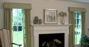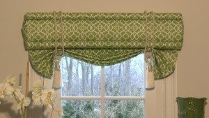
Greenery / Pantone 15-0343
I love this shade and I often refer to it as Apple Green. When I redecorated my family room a few years ago this is the color I wanted to incorporate, as it’s a pretty shade that can be treated as a neutral. Think of plants in your room. The vibrant color of leaves can mix with anything and add life and a fresh feel. The color Greenery is reinvigorating. This yellow-green hue is a happy shade. It is crisp, clean and lively. It makes you think of nature, lush foliage and the outdoors. As natures neutral, you can bring the outdoors into your home with confidence.
Also, when you consider today’s hectic society with the dominance of technology and social media, it’s only natural that we welcome the beauty of nature’s prediminant hue, green. It reflects our current trends in ecological conservation and sustainability. As a movement, we are all trying to live a little “greener”.
Please share your thoughts on Pantone’s 2017 Color of the Year, Greenery. We would love to hear how you used this shade in your own home. Share your photos with us too!


