
The Fall and Winter color trends are bolder and more expressive. According to Pantone, the colors for Fall/Winter 2018 express our need for individuality, ingenuity and creativity. Pantone Color Institute’s executive director Leatrice Eiseman states that designers and consumers are pedaling away from cyclical trends in favor of more self-expressive, nontraditional choices. The Pantone Color Institute has formulated a Top 10 list that plays up shades which disregard season, and bolder brighter colors are on the horizon. There is a definite shift towards self-expression through more vibrant hues. Scroll through the pallet below.

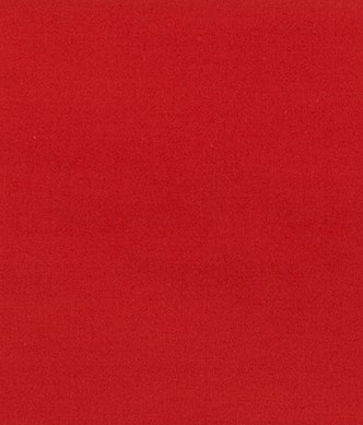
Red Pear 19-1536
Valiant Poppy 18-1549
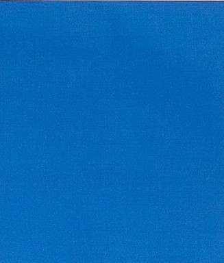
Nebulas Blue 18-4048
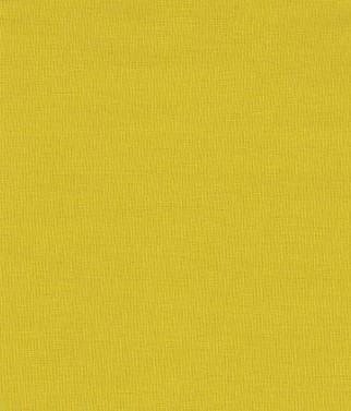
Ceylon Yellow 15-0850

Martini Olive 18-0625
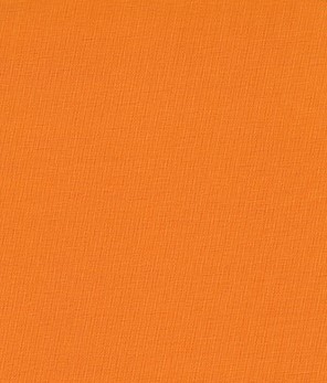
Russet Orange 16-1255
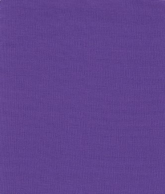
Ultra Violet 18-3838
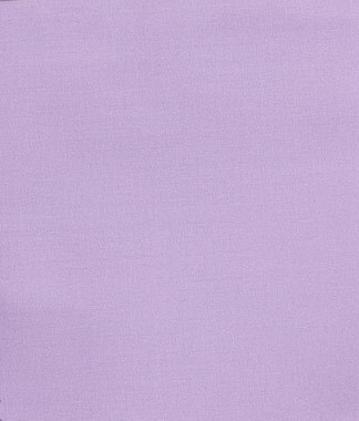
Crocus Petal 15-3520
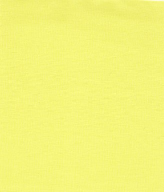
Limelight 12-0740

Quetzal Green 18-5025
And while these predictions primarily focus on the fashion industry, they inevitably influence interior design. While 2017 was more focused on warm neutrals, greens, and sophisticated accents of camel, we see a much edgier look for color palettes in home decor this year. Picture fiery reds, metallics, and, of course, a lot of Ultra Violet— the Pantone color of the year. These colors will be prevalent this fall and will continue moving forward into 2019’s design visual boards. I think it’s an exciting time for home decor. I believe people will become more comfortable being bold and experimental as we move into the future, and our rooms will reflect more of our own personalities instead of what is “traditional” and mainstream. Will you be more bold with you choices moving forward? I would love to hear your thoughts and feedback!